The Digital Restaurant Association (DRA) is a trade group dedicated to providing educational resources, technology solutions and public policy advocacy to restaurants in need. With about 30% of restaurant revenue now online, the DRA needed a visual identity that reflected its mission to help restaurants build a profitable business in the post-COVID era. I led concept development, creative direction, and final logo creation.

Color & Typography
The primary color chosen was an electric blue, a hue that reflects trust and integrity. For the typeface, I chose Univa Pro—a playful yet modern sans-serif.
The Logo
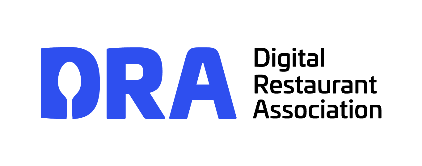
The client requested a memorable logomark, which led to the idea of placing a spoon silhouette into the negative space of the “D.” The result is a scalable and versatile icon that is legible at smaller sizes which makes it ideal for uses on a website, social media graphics, and print collateral.
Design Process
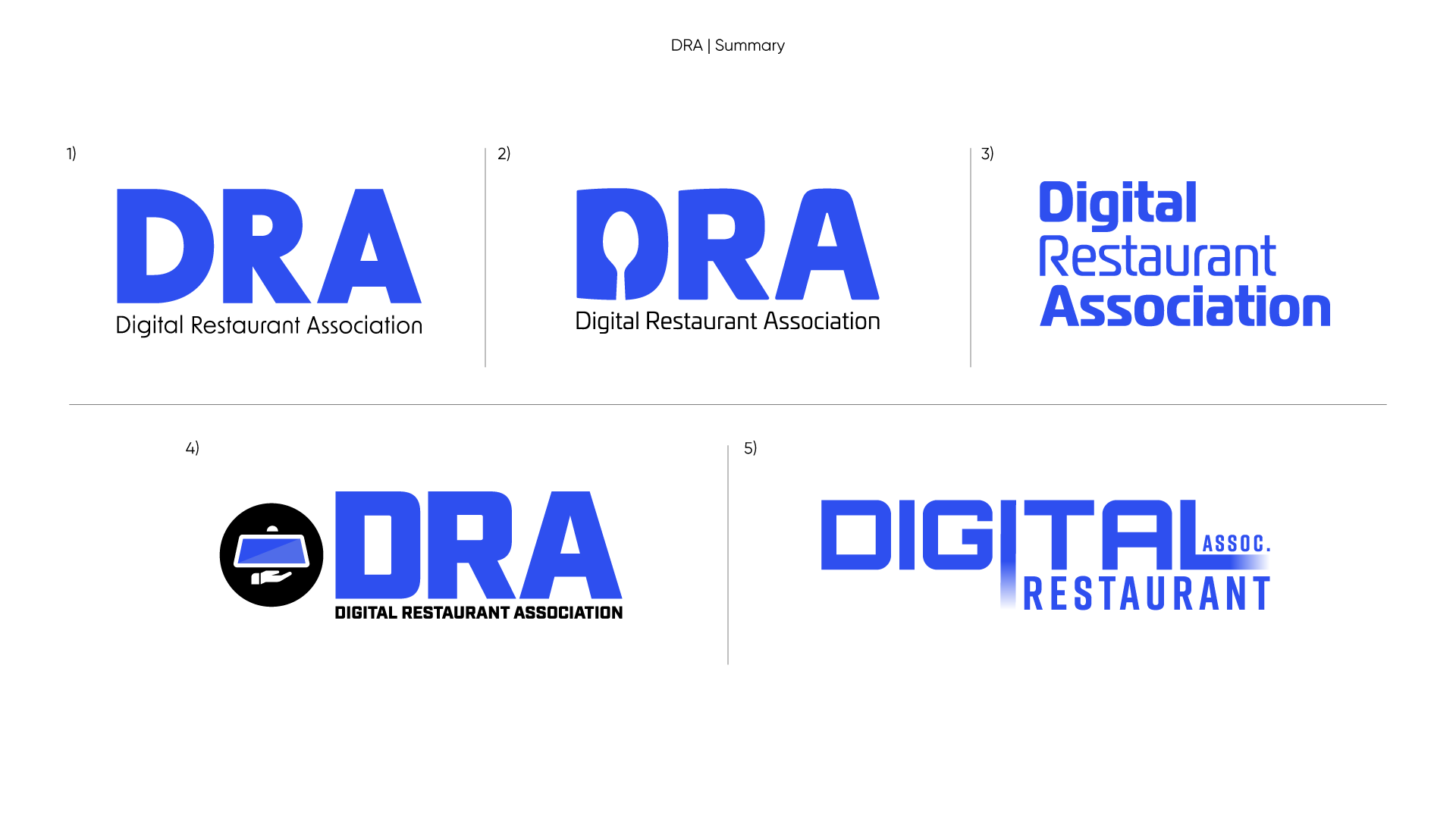
The design process included two main rounds of edits. In Round 1 I explored 3–4 directions, and in Round 2 I focused on the spoon-in-“D” concept, fine-tuning the shape of the spoon and enhancing the clarity of the negative space. The final version strikes a strong balance between playful typography and a unique logo.


The final logo was well received by the client and board of directors, who appreciated its cleverness and alignment with the DRA’s mission. It has since been used across key touchpoints, including their website, advocacy documents, whitepapers, social media platforms, and pitch decks.